Color Theory Fundamentals
Color theory provides a framework for understanding how different hues interact visually. In food styling, we apply these principles to select ingredients that create pleasing compositions.
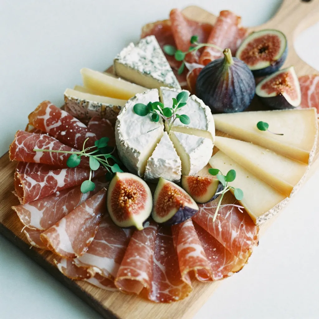
Complementary colors, positioned opposite each other on the color wheel, create dynamic contrast. For example, the deep purple of blue cheese against the warm orange of dried apricots creates visual interest through contrast.
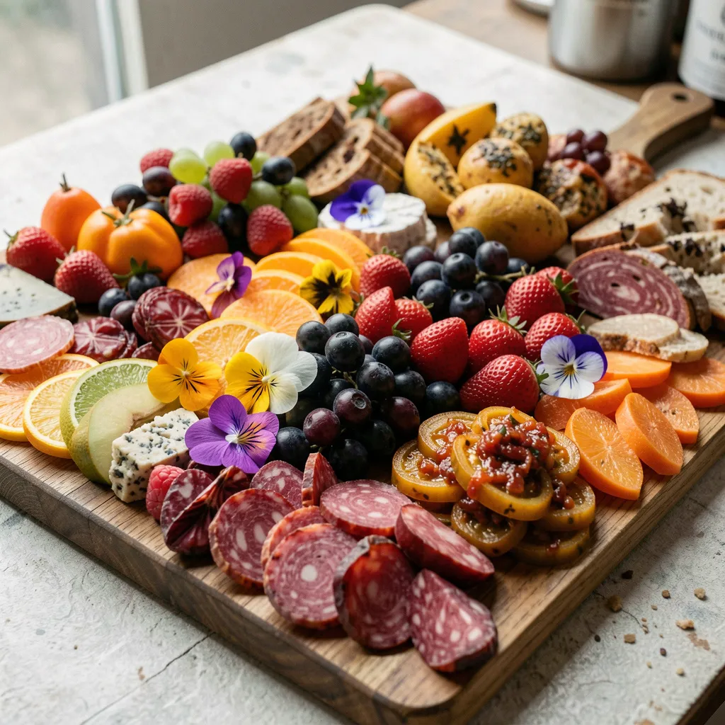
Analogous colors, those adjacent on the color wheel, create harmony and flow. A board featuring various shades of red, orange, and yellow creates a cohesive, warm aesthetic.
Practical Applications
Ingredient Selection Guide
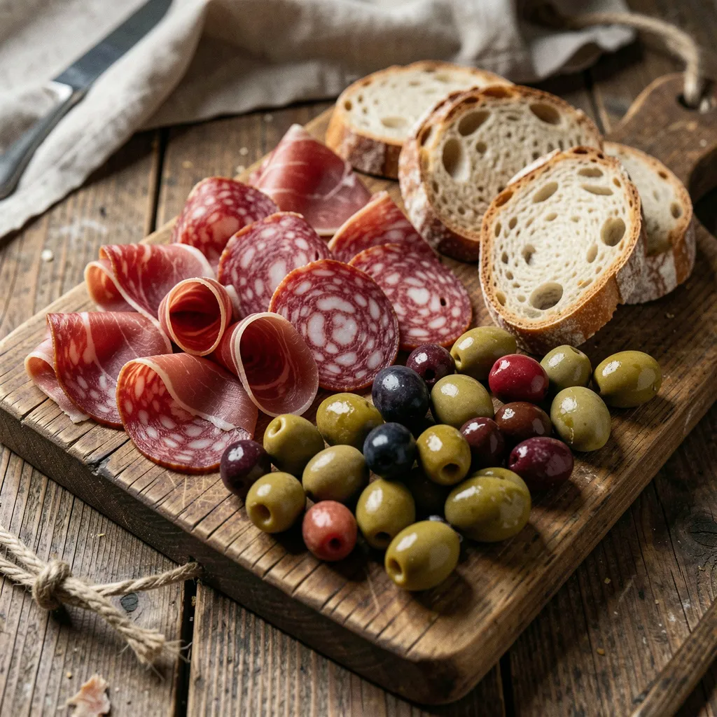
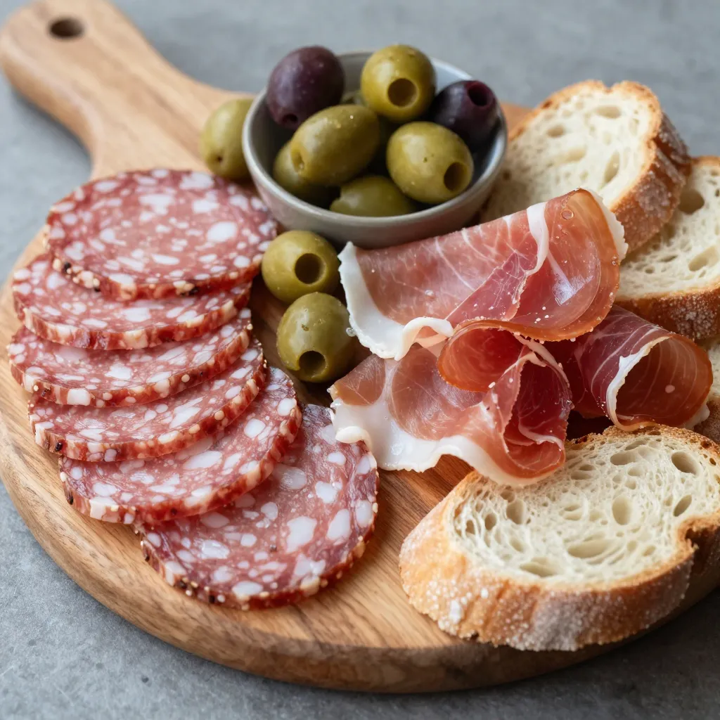
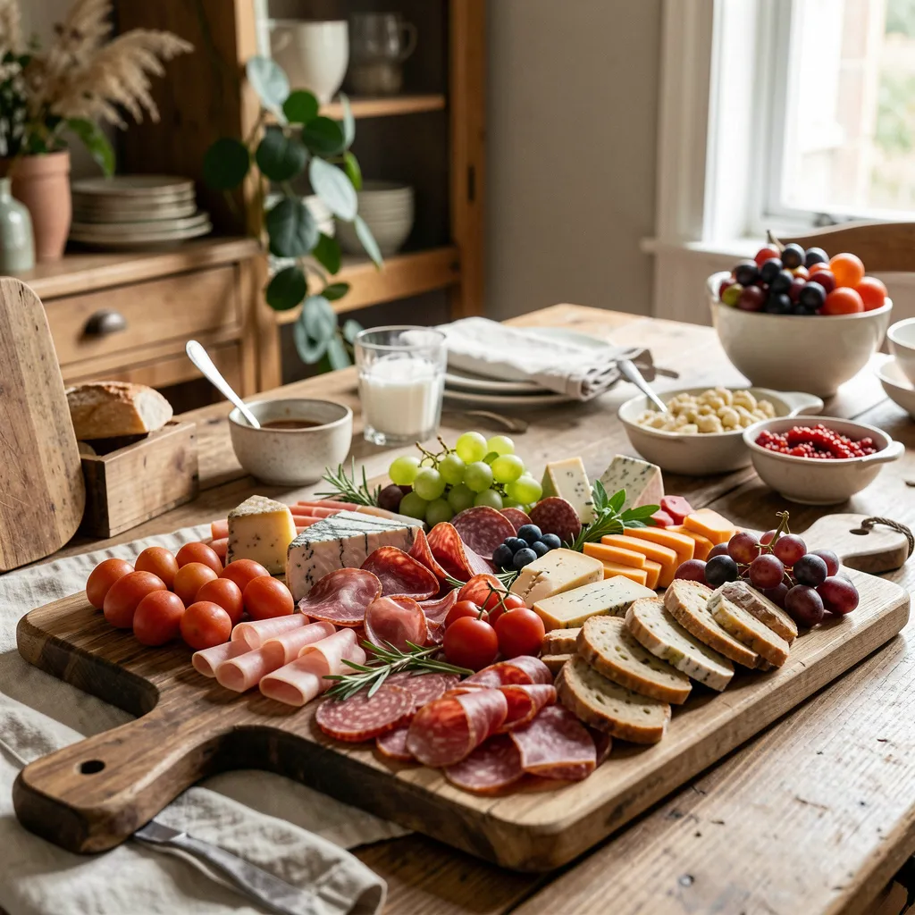
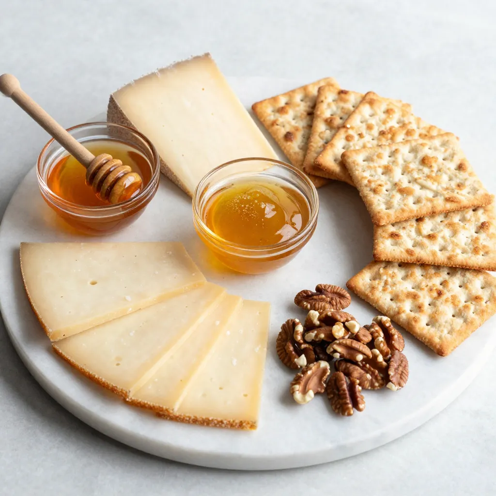
When planning a board, consider the color profile of your ingredients. Cheeses range from pale whites and yellows to deep oranges and blues. Meats offer reds, pinks, and browns. Fruits and vegetables provide the full spectrum.
Start by identifying your dominant color or desired aesthetic. Then select ingredients that either complement or harmonize with that base. Remember that texture and shape also contribute to visual interest, so color is just one element of the composition.
Consider the background and serving surface as well. Dark boards make light ingredients pop, while light surfaces provide contrast for darker items. The overall color story should feel intentional and balanced.
Learn More
Color theory is just one aspect of food styling. Explore our masterclass sessions to learn how to apply these principles in your own space, or browse our prop library to discover tools that enhance your presentations.